


The #1 Question Every Website Visitor Has
The single thought every person has when they read your website or your LinkedIn About page is what does this company do?

When people come to your website the number one question they have is “what do you do?” and the second question they have is “can you solve my use case?” The third question is “how much do you cost?” But somehow we manage to word vomit all over our website and our LinkedIn About pages making it unclear for the reader to make sense out of it all.
I cannot tell you how many times I’ve gone to a company’s website or their LinkedIn About page to learn what they do, especially during my recent job search, and walk away scratching my head. 🤔
One could argue to articulate what you do on a website is harder because you have to capture the audience in a small space, traditionally above the fold. I can buy into that.
However, on LinkedIn you have zero excuses because you get a whopping 2000 characters to spell it out, plus space for a tagline.
I admit, it’s not easy to write concise messaging. It’s an art. This is why great product marketers are so in demand. (And why I have often written about how to write great headlines, like this LinkedIn article from 2022).
I am about to do what I would advise you to NEVER do which is criticize any company in a public forum. However, I am offering polite suggestions on how I would improve their descriptions. Plus, I doubt they’ll ever see this post.
Key components to writing a good company descriptors
Write no more than 2-3 sentences and include, what you do, who you’re for, and what problem you solve. If you can’t get it all in there, then just say what you do and the impact your product delivers.
Less is more. If you say what you do and the impact you deliver, it makes someone curious enough to click through to your website. Your website is where you can tell them more detail.
The Tear Down: Companies that get messaging wrong on LinkedIn
Now you may have heard of some of these companies, but have you ever asked yourself what do they actually do?
(These are real examples as of 11/17/24)
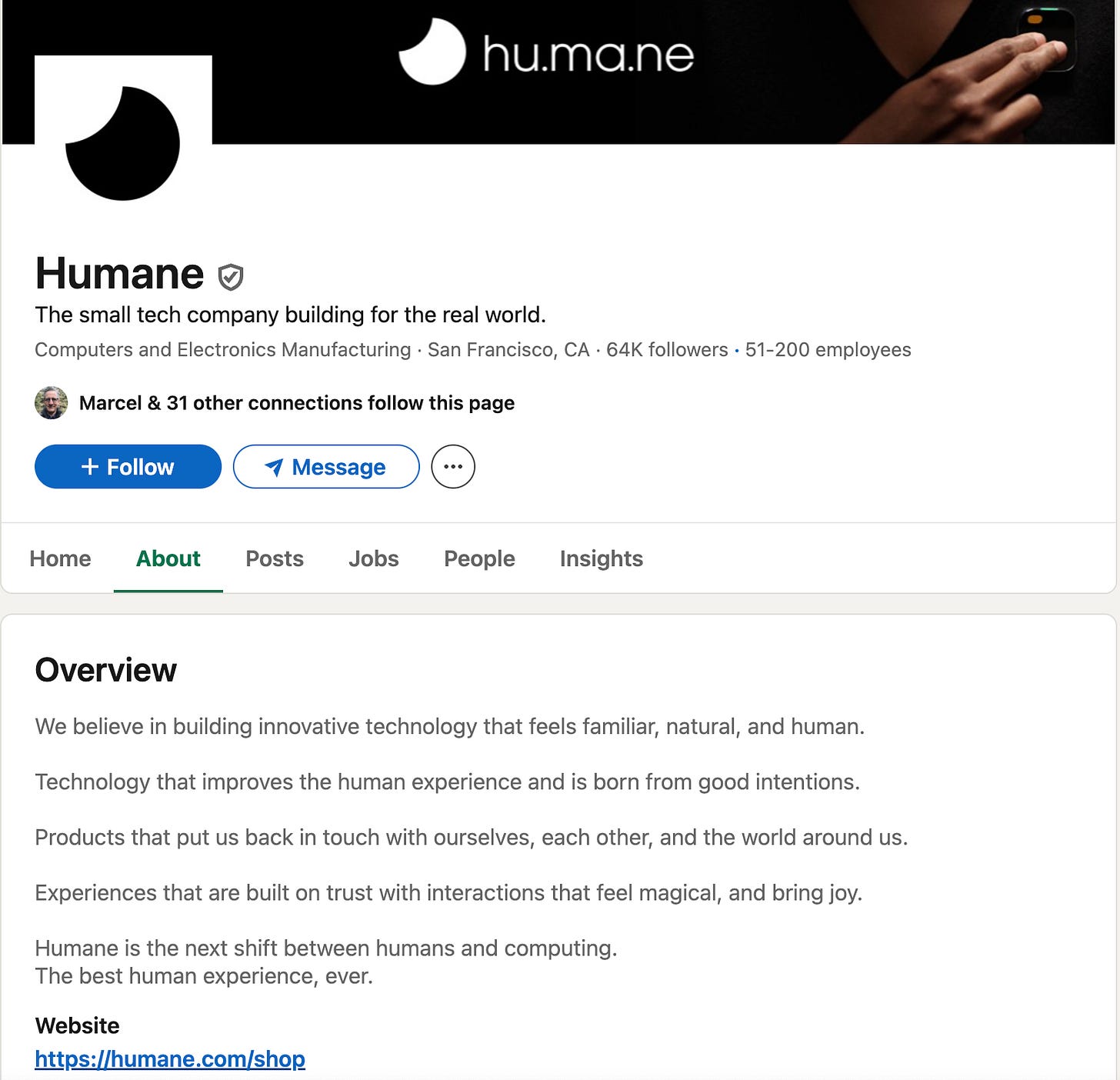
Humane - it all sounds good but I literally have no idea what they sell other than joy. I went to their website and I can see they sell something called Ai Pin which comes with a phone number and unlimited talk, text, and data. Humane’s wireless service is connected by T-Mobile. So they seem to be wearable tech like an Apple Watch?? But I still don’t quite know what I’m getting for $699 + subscription cost and their website is also full of fluff jargon. Will this product fail? I’d bet yes.
Builder.io - I’m all for brevity but this description is somewhat challenging. Even though I am not their target audience, it just seems like there could be a tad more here. Am I wrong? They are actually an AI powered visual design platform - for digital marketers/designers. But when I look at this, I think developer and coding. Even their name makes me think the same. Rebrand time, maybe? 🤷🏻♀️

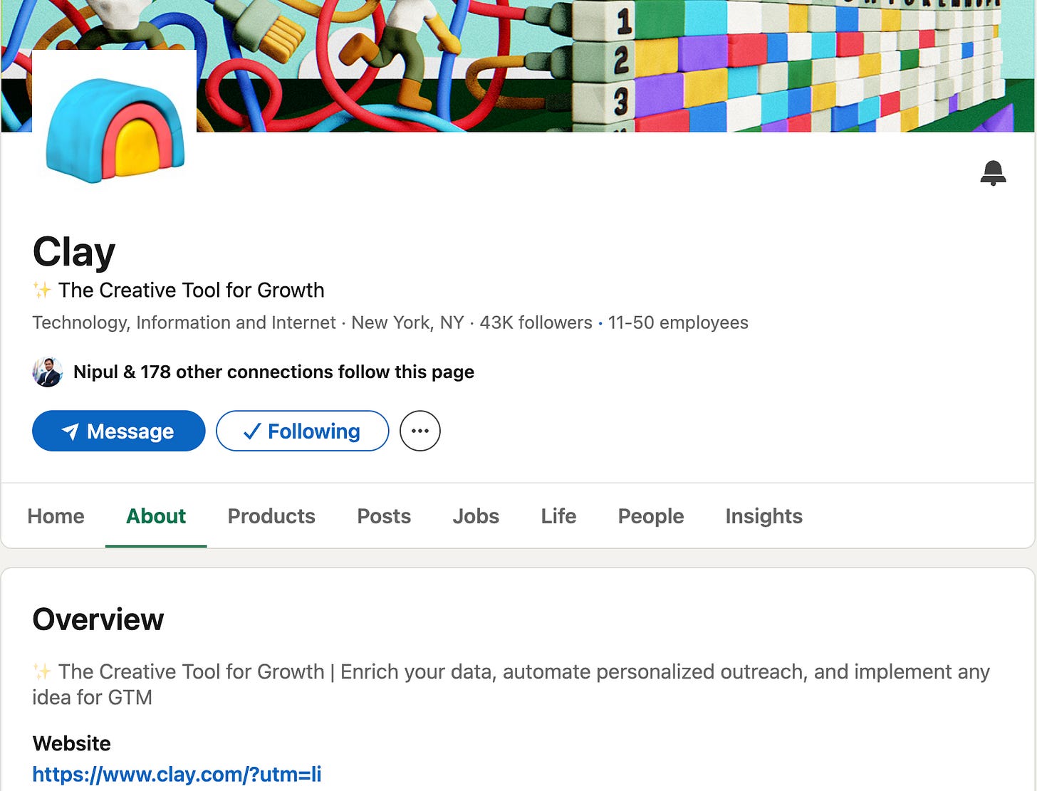
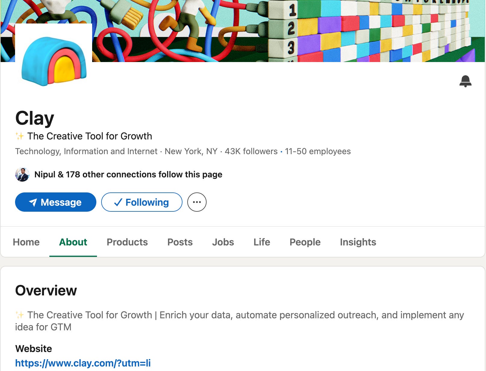
Clay - yep, you know them because you’ve seen their advocates all over LinkedIn (kudos to them for this play, btw, brilliant!) But, if it weren’t for those advocates showing you how to use it, would you really understand what they did from this LinkedIn About page description? Doubtful, it’s a broad “dreamer/vision” statement that means absolutely nada to the reader. It looks like all they do is enrich data, but they can do so much more than that. It’s really a cool product. They need some product marketing help on their messaging to make it more crisp.
Cognizant - a public company…with a lot of fluff. It says nothing about what they do. Oh wait, they “engineer modern businesses” - what exactly does that mean?? Honestly, I am not sure that Cognizant knows what they do or why they do it based off of this description. This is a prime example of when companies get too large, they lose sight of their brand purpose, and the brand becomes all fluff. (Read the art and science of brand building).

Wix - it’ not terrible. It does say what they do, however, it’s just too-many-words. When your verbose, you make your product sound more complicated than it is. Honestly, they’d do themselves a favor if they just stopped after the first line.💡
(For comparison, just look at Webflow’s below.)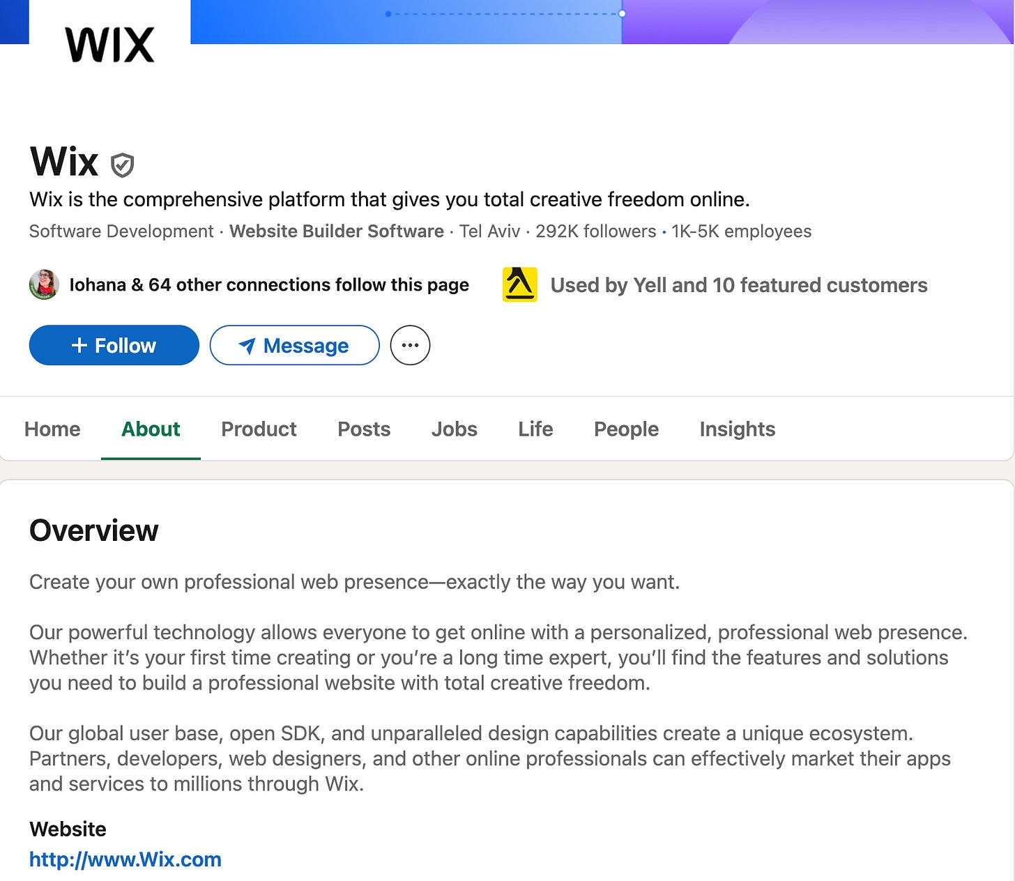
⭐ The Praise: Companies who get messaging right 💡 on LinkedIn
Webflow - simple, concise.

Common Room - a little wordy, but still straight forward. They lead with social proof and tell you what they do. I might rewrite it as, “Capture every buying signal at the person level to run high-converting plays at scale” (because every intent company captures at the company level, but what makes Common Room unique is they capture at the person level). But it’s great as is.

Papaya - I love this! It’s all summed up in the first two sentences. You know what they do. They go on to show empathy about the problem. The rest is fluff, but out of the gate you know what they do in the very first sentence: They help you pay your bills online via your phone. Simple. So even if you have A.D.D. - you get it.

HockeyStack - I recently had it out with the CEO of HockeyStack on LinkedIn who has no regard for marketing. However, this might win the award for one of the best LinkedIn About pages. Kudos ⭐ to his VP of Marketing, Claudia Ring and her team. It’s short, sweet, and to the point. It tells you who they are, who they’re for, what they do, and the value you’ll get.


I could go on all day with these because there are so many examples, both good and bad. The point is you should treat your LinkedIn About page and all of your social media profiles, like a free billboard for your brand, because they are.
If you liked this article you may also like:
